#24 - Lessons from Developing a Location-Based Transfer Product - Carol Tran, Product @ Mantu
Carol Tran shares lessons from developing a location-based transfer product at a FinTech company. Despite initial excitement, technical difficulties and user experience concerns led to the product's eventual failure. Here's what she learned from it!

Hello, I'm Thomas 👋! Welcome to this special issue of my newsletter on Product and Startups. I'm excited to feature a rising talent from our (paid) Product Community, who is sharing her first piece of long-form public writing.
Who is Ngoc Tran (Carol?)
Who is Ngoc Tran (Carol)? Carol is a mid-level product owner who continually enhances her mindset and skillset to deliver impactful and viable products. You can visit her portfolio here: Carol's portfolio.
I first connected with Carol when she scheduled a casual conversation about Product Management through Calendly. I was pleasantly surprised when she decided to join my Product Community—a place where product practitioners converse and learn from each other.
Carol stands out for her inquisitive nature. Whether it's during an office hour session, on our Discord server, or during a guest lecture, Carol consistently asks thoughtful and genuine questions. This eagerness to learn makes her an exciting person to be around.
When I heard Carol finished her first long-form article, I was excited to check it out. It was exactly the type of content I want to popularize. With her permission, I want to use my (limited) social media presence and this newsletter to help her content reach a wider audience.
Let's celebrate Carol's first guest post on the newsletter! 🎉🎉🎉

Welcome to my first blog! I wanted to create a series of lessons that I learned from the past. It's a chance to reflect, as well as a way to improve my career prospect.
I believe that people thrive more in times of crisis and learn more by experiencing failure. Hence, I want to make this first post about a failure that has always been at the back of my mind.
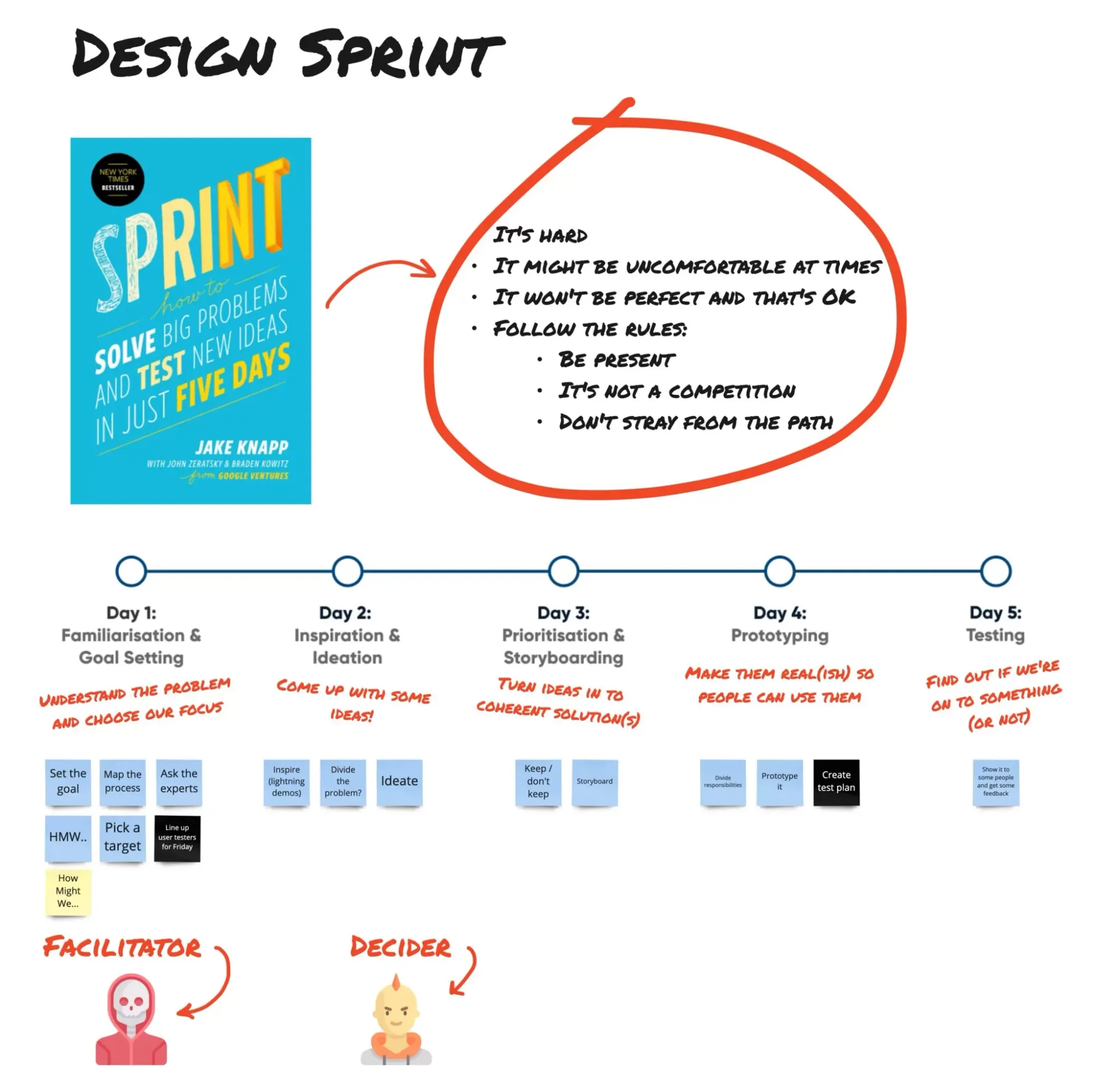
It was 2022, as far as I remember, the 2nd month of my first year working as a product owner. I worked at a FinTech company, under the peer-to-peer transfer team. And I was lucky enough to join right in the time that we had a 5-day Design Sprint session, in which the team hired an international product expert to be the host.
The topic during that Design Sprint was “How to get more shippers to use our app?” because our Director bet on Cash On Delivery (COD). Basically, it's when people pay the shippers directly upon successful package delivery.
We, a team of product, design, data & researcher, did a lot of brainstorming and interviewing, just to come closer to the fact that it was really hard to target shippers, due to many reasons (their cash flow process was not suitable for a FinTech app, they prefer banks since people could use any app to transfer to bank account, etc.).
But we did come up with a lot of product ideas to build. “Nearby transfer” was one of them. And since we had spent 5 days in the Design Sprint, we decided to give this product a try.
The Product
“Nearby transfer” can be simply explained as a location-based transfer product. We'd track the receiver's location, and allow the sender to conduct the transaction without asking for a phone number or QR code.
In theory, it'd be a product that embodies the “FAST” unique value proposition that our app was always proud of. It could be even faster than entering a phone number.
The concept of using location-based to find someone is not new
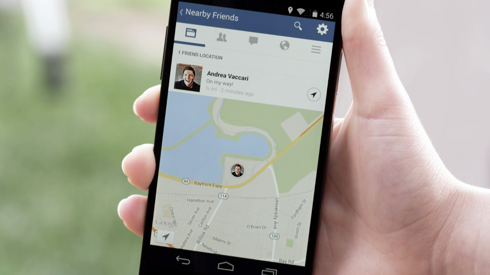
In 2014, Facebook released a feature called “Nearby Friends”, where you can discover any friend near your location.
Zalo also has a feature called “Tìm quanh đây” (nearby search), which is similar to Facebook, but they went with a flat list instead of an interactive map for the User Interface.

How did we imagine that this product would create value?
This is how we imagine when when people want to pay with COD:
- Shipper: Can you pay by <our fintech app>?
- Customer: Yes, can you give me your phone number?
- Shipper: No need. Since we are nearby , you can make a payment to me via the the feature “Nearby transfer” in the app.
Well, to be fair, the customer would definitely need to ask for the shipper’s name and check that against what they see in-app to make sure payment is going to the right person.
But it sounds like a dream. Very innovative! 💡
As a newbie with no product experience, I began developing wireframes for the app, because that's the artifact that I was most comfortable with due to my previous marketing background.
I did not feel this product would be a faster mean of transfer than using phone number; nor did I think the shipper would feel comfortable instructing their customers how to use this product, since they need to optimize their shipping time and teaching people to use a new feature is not easy.
I told my team how I felt at the time, and asked for one more week to validate this feeling, just to see if this product was really worth developing. But the team decided against that, and wanted to build an MVP instead. Once the product was released, we believed we could get the feedback from users to know if it would work. So the MVP version of this product was in development.
And it was around 1 year later till we realized this was a failure.
The Risks
Risk #1: the technology
When discussing with our developers, both the front-end team (FE) and back-end team (BE) were very excited. After all, this was a new technology at the time that no one in our company had built before.
However, it was hard for us to estimate when the implementation of this new technology would finish, especially on the BE side. At first, we planned to have 1 week for BE to do research, followed with 1 sprint for development. But it did not turn out as planned.
There was a time when our team thought that everything was ready. However it failed to get the location during testing, and we needed to wait for the issue to be fixed. With the pressure from product leaders, we finally had something to test after 3-5 months, but the location was still not stable.
Risk #2: UI & animation
I remembered spending months finalizing the layout for the “Nearby Transfer” app. The first UI was similar to iOS Airdrop, where you could see the person’s avatar and name, categorized into different sections - “Friends”, “People you might know”, and “Strangers”.
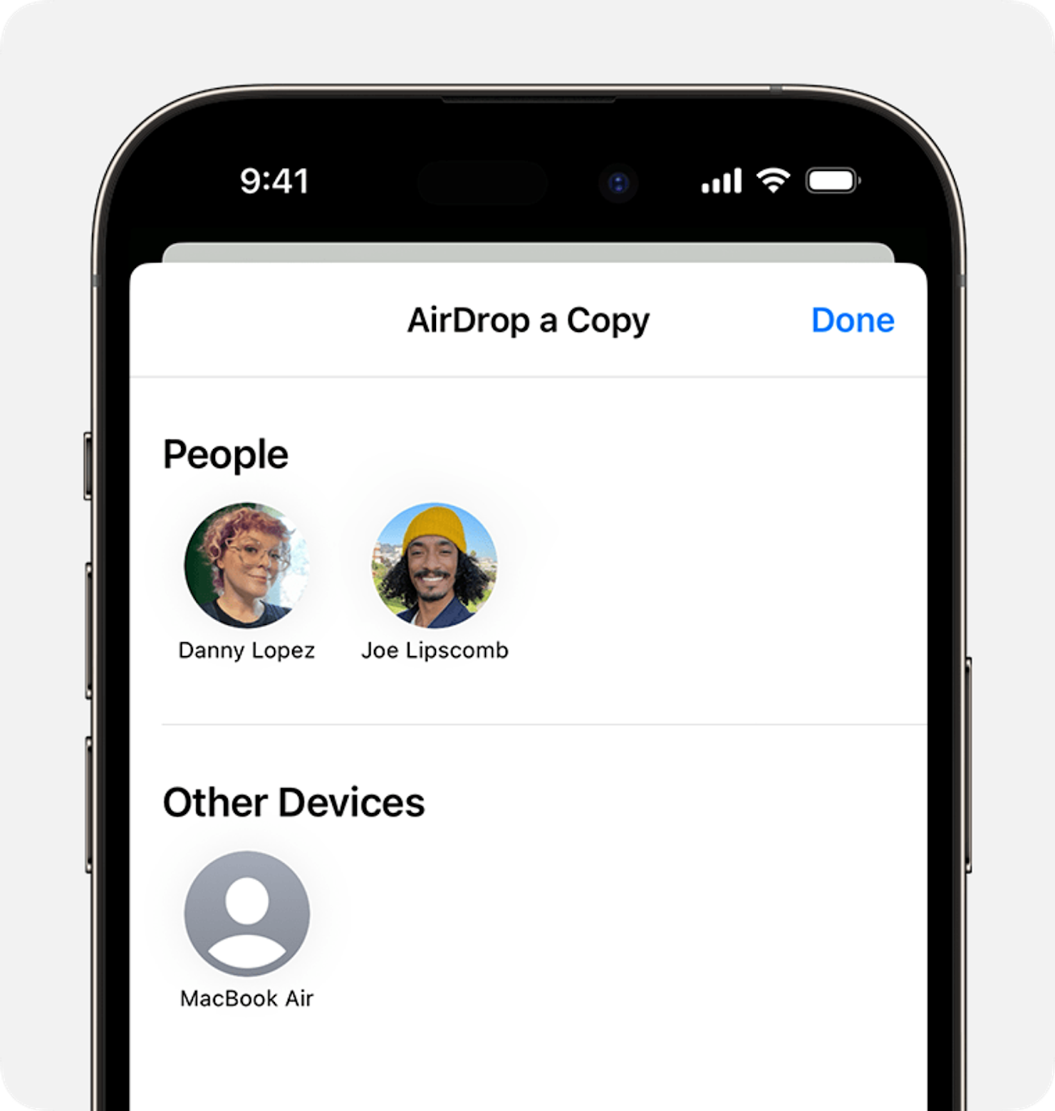
This type of UI was clean, and had plenty of estates to show the full name of the recipients (in Vietnam, the name was pretty long - my full name is TRAN HUYNH MAI NGOC).
The developers opposed, saying that this UI was boring and looked just like a normal contact list we already had on our app, which would not attract users to try the new product.